Color Theory 101: A Beginner’s Guide to Choosing the Perfect Palette
Coloring is one of the simplest ways to relax and express your creativity—but have you ever wondered why certain color combinations look better than others? That’s where color theory comes in. Mastering the basics can help you make more confident choices, whether you’re filling in intricate mandalas, whimsical patterns, or cosmic flowers. In this post, we’ll explore core principles like the color wheel, warm vs. cool shades, and color harmonies. Plus, we’ll show you how to apply these insights to two of our most beloved coloring books: Boho Spirits and Celestial Blooms.
1. Getting to Know the Color Wheel
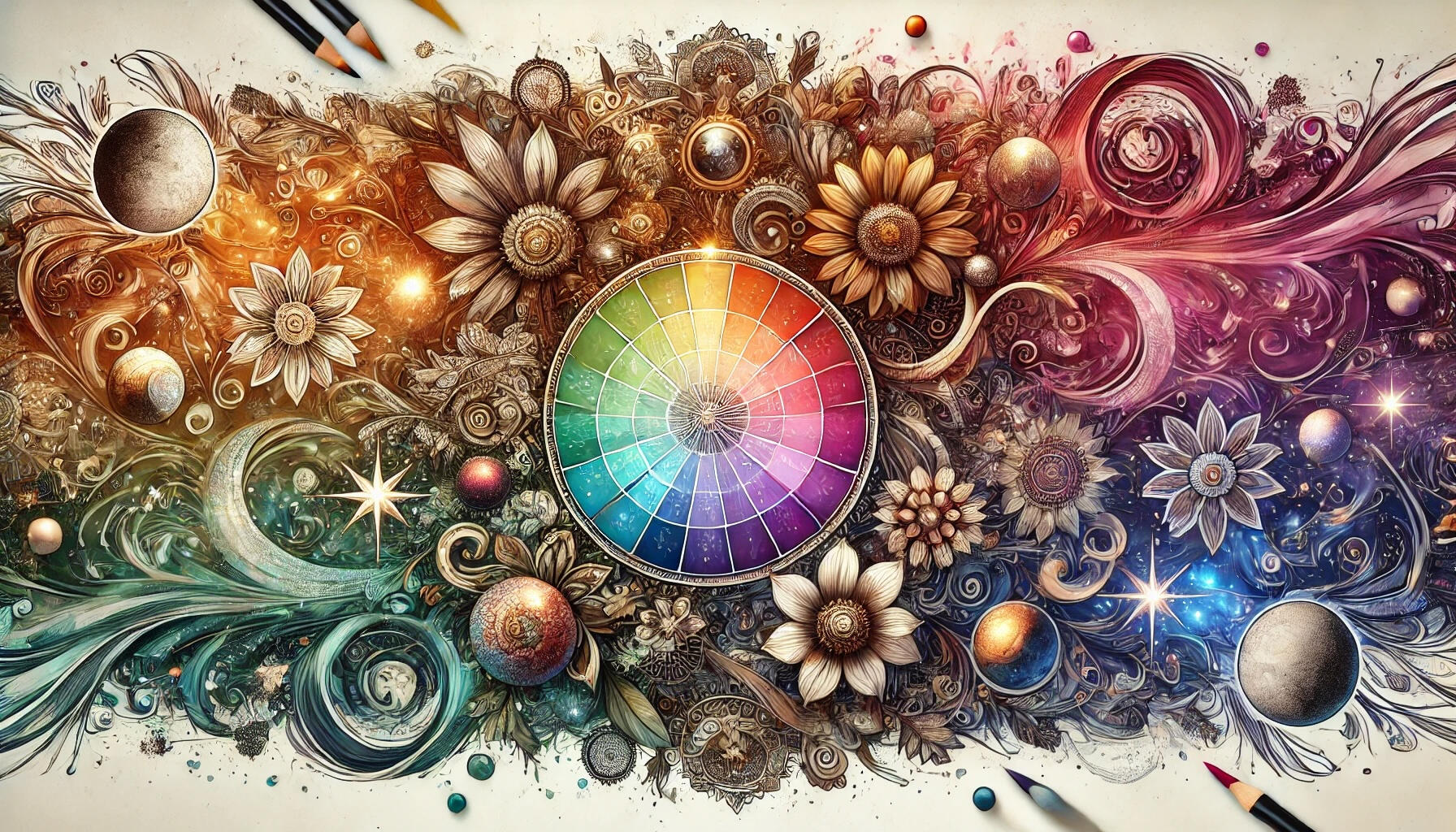
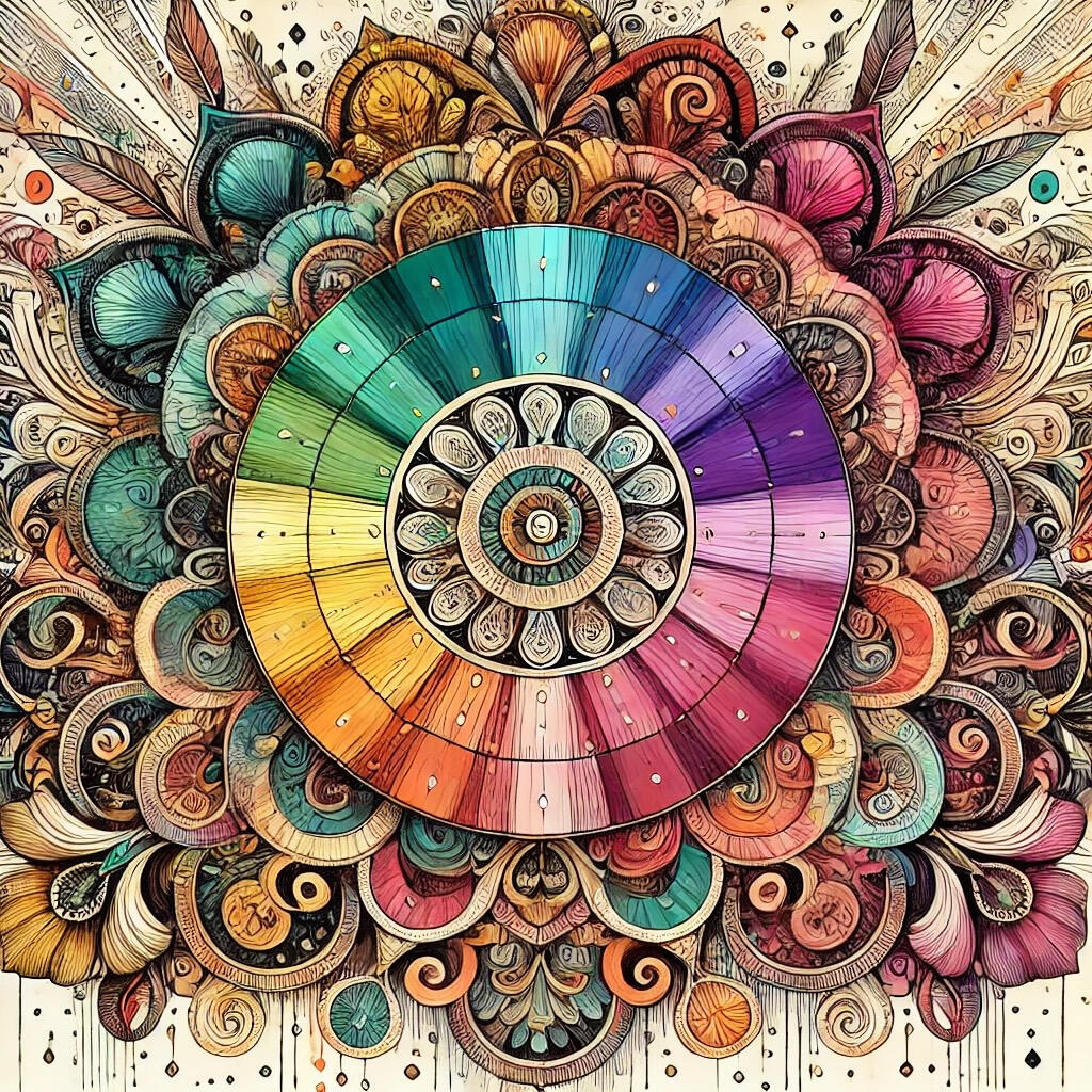
At the heart of color theory lies the color wheel—a circular arrangement that visually represents how colors relate to one another. The traditional 12-color wheel consists of:Primary Colors: Red, Yellow, Blue
Secondary Colors: Green (yellow + blue), Orange (red + yellow), Purple (blue + red)
Tertiary Colors: Shades formed by mixing a primary color with a neighboring secondary color (e.g., red-orange, yellow-green, blue-purple)
When coloring, keep a printout or an app-based color wheel handy. You’ll be amazed how often a quick glance helps you pick the perfect hue or find a new palette to experiment with.Apply It to Boho Spirits & Celestial Blooms
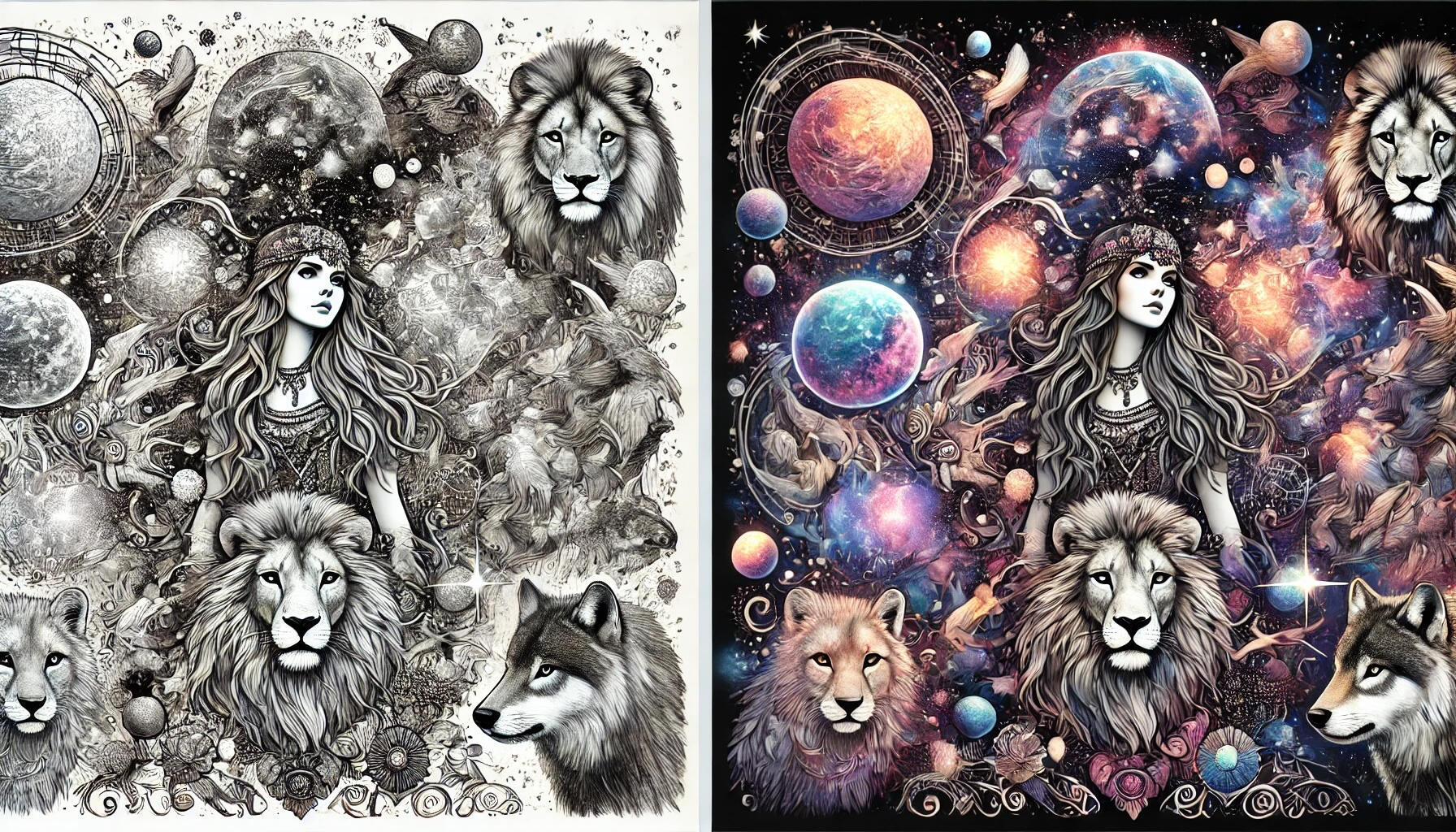
In Boho Spirits, you’ll find free-spirited motifs and intricate geometric designs. A color wheel helps you decide which tones work best for the bohemian vibe—like mixing warm oranges and reds with bright turquoise accents for that quintessential boho look.
Celestial Blooms merges the serenity of flowers with cosmic elements. Try using secondary or tertiary color combos (e.g., purple-magenta, blue-green) to capture the dreamy feeling of celestial space.
2. Warm vs. Cool Colors
Another simple way to categorize colors is by splitting them into warm and cool groups:Warm Colors: Red, Orange, YellowThese hues exude energy, optimism, and heat. They tend to “advance” in a composition, making them perfect for eye-catching focal points.
Cool Colors: Blue, Green, PurpleCool tones feel calming, often associated with sky, water, and nighttime. They tend to “recede,” making them useful for backgrounds or softer moods.
When to Use Warm or Cool
In Boho Spirits, warm tones can bring out the lively, adventurous spirit in mandalas or tribal patterns.
In Celestial Blooms, you might lean more into cooler hues (like midnight blues, lavender, or teal) to evoke a cosmic, tranquil ambiance—though a pop of yellow or orange can create striking contrast.
3. Basic Color Harmonies
Color harmonies are tried-and-true relationships that guide you in combining colors effectively. Here are a few favorites:1. Complementary• Colors directly opposite each other on the color wheel (e.g., Red & Green, Blue & Orange).
• Ideal for creating high contrast and a lively, bold design. In Boho Spirits, imagine pairing bright teal with a dusty orange for a spirited, eye-catching vibe.2. Analogous• Colors next to each other on the color wheel (e.g., Yellow, Orange, Red).
• These create a soothing, cohesive palette. In Celestial Blooms, try analogous purples, blues, and teal for a peaceful, cosmic gradient.3. Monochromatic• Multiple shades, tones, and tints of a single hue.
• Sophisticated simplicity. Perfect if you want to emphasize line art or highlight the design’s intricacy.4. Triadic• Three colors evenly spaced on the wheel (e.g., Red, Yellow, Blue).
• Offers a bright, balanced palette. Great for bold designs in either coloring book—just pick one color to dominate and use the other two for accents.
4. Putting Color Theory into Practice
In Boho Spirits
When coloring Boho Spirits, think about the emotional energy you’d like to convey:• Warm & Lively: Use a triadic palette of red, yellow, and blue to give your design a vibrant festival-like atmosphere.
• Earthy & Grounded: An analogous palette of browns, oranges, and golds can mimic desert boho aesthetics.Explore Boho Spirits here and let your creativity dance across each page.In Celestial Blooms
Celestial Blooms fuses the serene beauty of flowers with the mystery of space:• Cosmic Contrast: Choose complementary shades like purple (for deep galaxy backdrops) and yellow (for glowing stars).
• Dreamy Pastels: Try a monochromatic or analogous scheme of pinks and purples, enhanced with soft gradients for a truly ethereal look.Ready to color your own galaxy of flowers? Get Celestial Blooms today and embark on a cosmic coloring adventure.
5. Pro Tips for a Stress-Free Coloring Session
1. Swatch Your Colors• Before you start, test pens, markers, or pencils on a separate piece of paper or the book’s back page. This ensures you know the exact shade (sometimes the barrel color can be misleading).2. Start Light, Layer Up• It’s easier to build depth by layering gradually rather than going too dark from the outset.3.Focus on One Section at a Time• Avoid getting overwhelmed. Choose a small area—like the petals of a bloom or a single mandala—and color it completely before moving on.4. Incorporate Texture & Variation• Experiment with shading, cross-hatching, or blending multiple hues to add dimension.5. Relax & Enjoy• Coloring is as much about the journey as the final piece. Slow down, savor the process, and let the stress of the day slip away with each stroke of color.
Final Thoughts